|
|
|
|
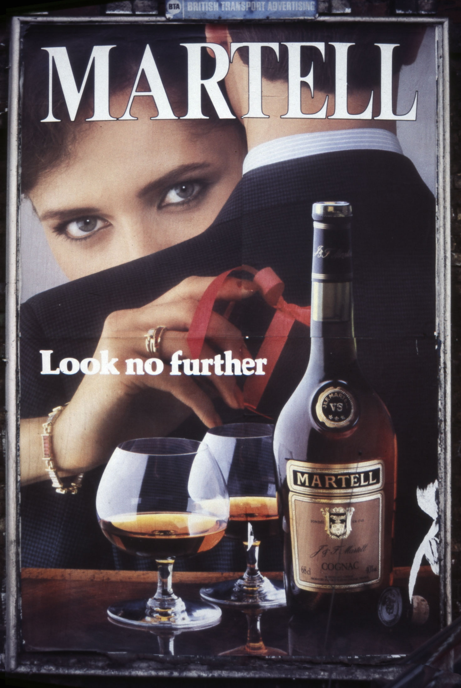
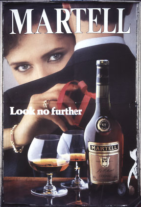
AD: 'MARTELL' BRANDY -
(SMALL HOARDING ON STREETS) - (1986)
A
highly integrated and active image formed from collaged visual and text fragments related as a single semantic structure:
There are 5 main elements/visual layers:
1 a woman's gaze,
2 a man's back, separating her face from ...
3 a hand with rings and ribbon,
4 two filled glasses and bottle with label,
5 text (line and heading).
The most surface image element, the copy-line "Look no further", commands ones gaze not to enter the Ad's space, increasing the potential of ones (male) desire to reach the spatially deepest and most attention claiming element, the woman's gaze.
The prohibition is (subliminally?) reinforced and sexually specified by her wedding ring touching its 'O' to the o of "..no.." - then lifted: as the ring is discovered to be on the
'wrong' hand.
The last barrier to meeting is thus removed except for a well groomed male back. A flat collaged cut-out, its lack of substance simply provokes my (male) sense of competitive success.
Our relationship established I notice she invitingly pushes forward two filled glasses ('mine' in front of the prohibitive surface copy-line), while playing with a
disheveled pink ribbon, caressing a (female) glass rim and pointing to the (male) bottle whose label "Martell" also endorses as a heading the activity of the whole
fantasy/image.
|
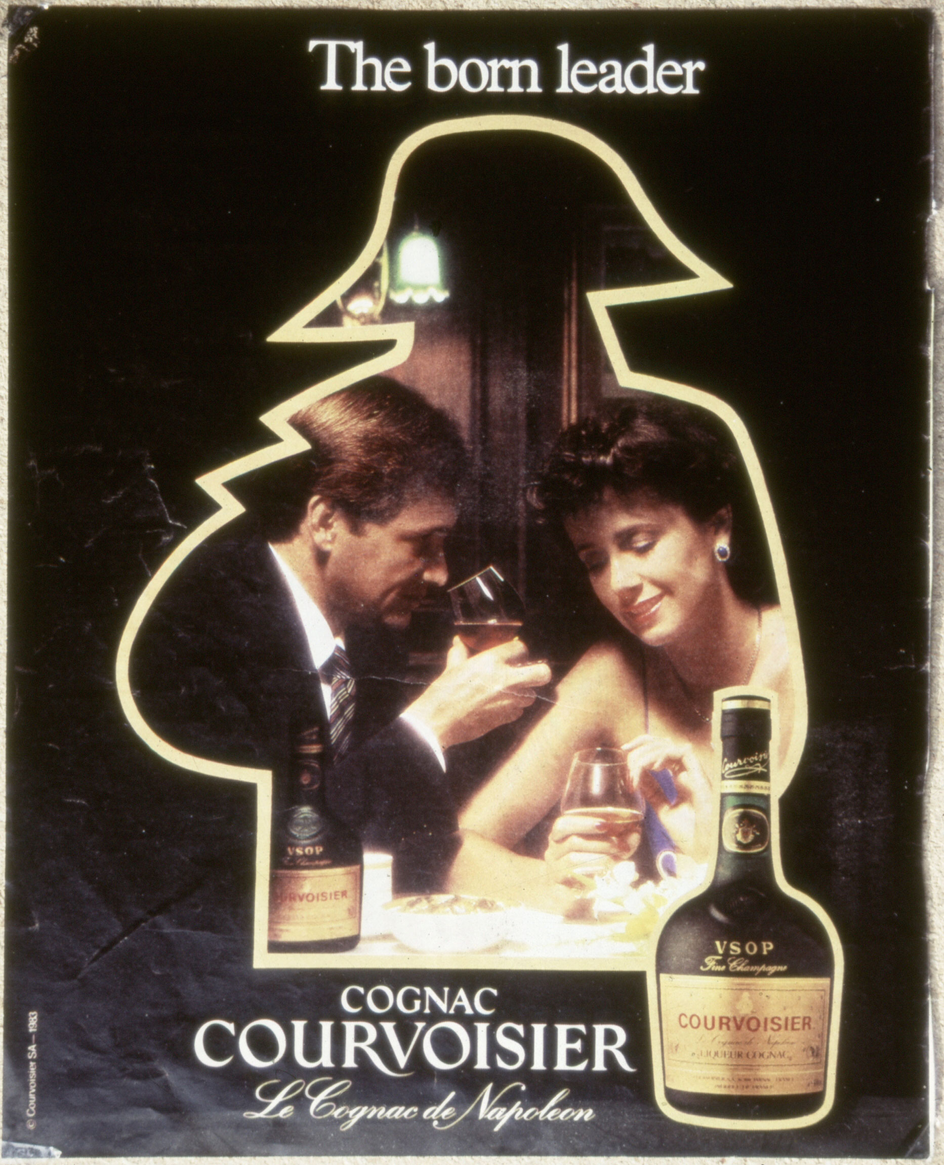
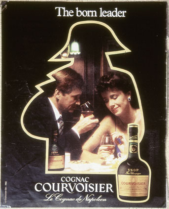
AD:
'COURVOISIER' BRANDY - (MAGAZINE PAGE) - (c1986)
Compared to the previous ad this one is pathetically incompetent and
un-influential. It uses a commonplace pre-collé pictorial presentation
structure of 3 parallel planes - the previous-culture's 'theatre' or
'peep-hole' space-design. Its one attempt at wit is to encase its
'how-to-use-its-product-situation-example' in a proscenium frame shaped
like a 'Napoleon' (the shape that's used as its mnemonic brand-image on
all its products and ads). Even this simple schema however is a muddle of
awkward relationships - the Napoleon 'frame' seems to weirdly bulge to
contain and present to us (the 'theatre audience') the foreground bottle [1],
whose position pushes the text title to the side, apparently pointlessly
disturbing the ad's banal symmetry.
NOTE
:
-
Which
'breaks the picture-plane' (established by the text-title) - a Renaissance
'reality-proofing' device (Re: Crivelli -
Annunciation - 1486 - National Gallery, London.)
|
|
|
|
|
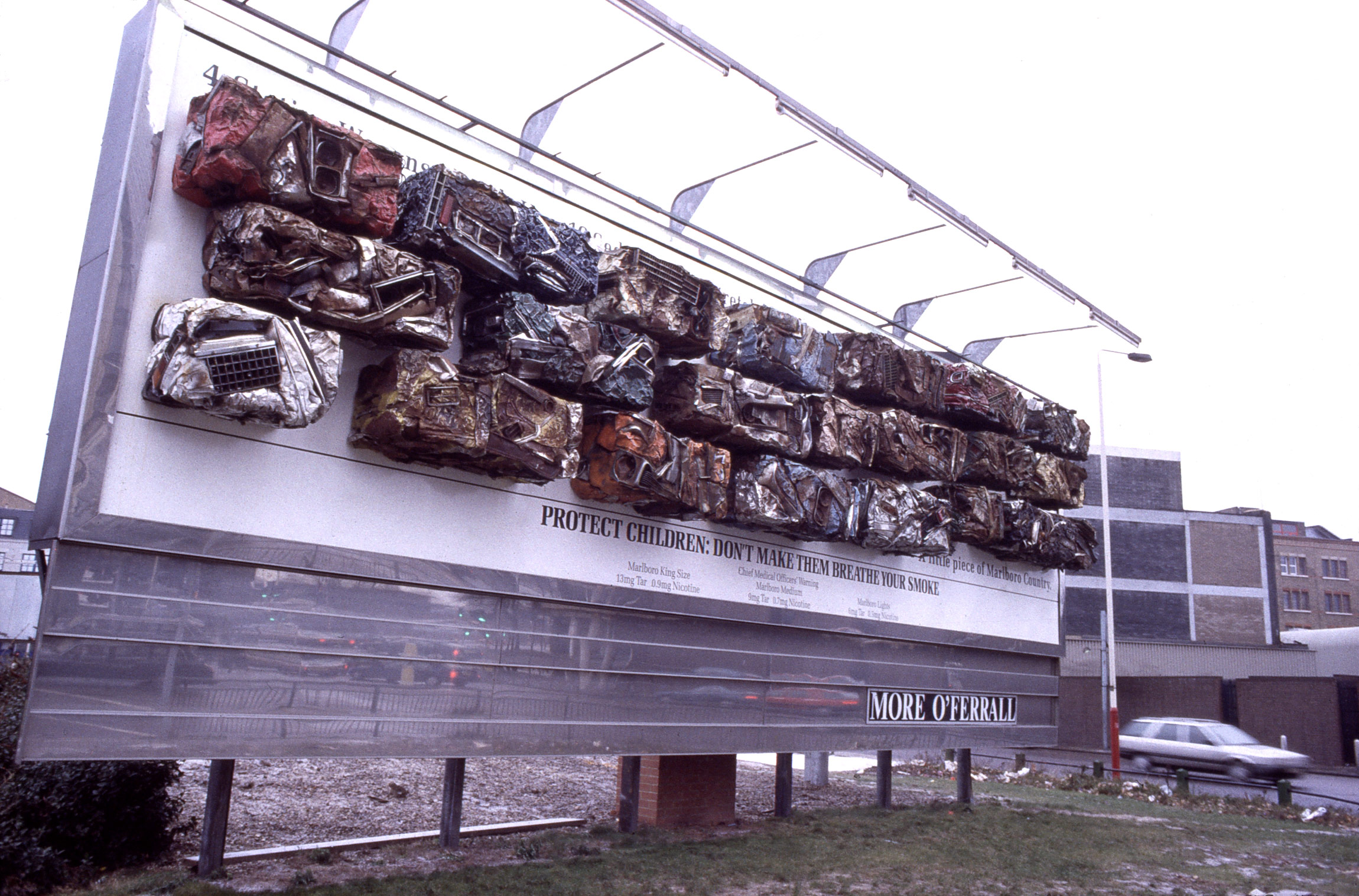
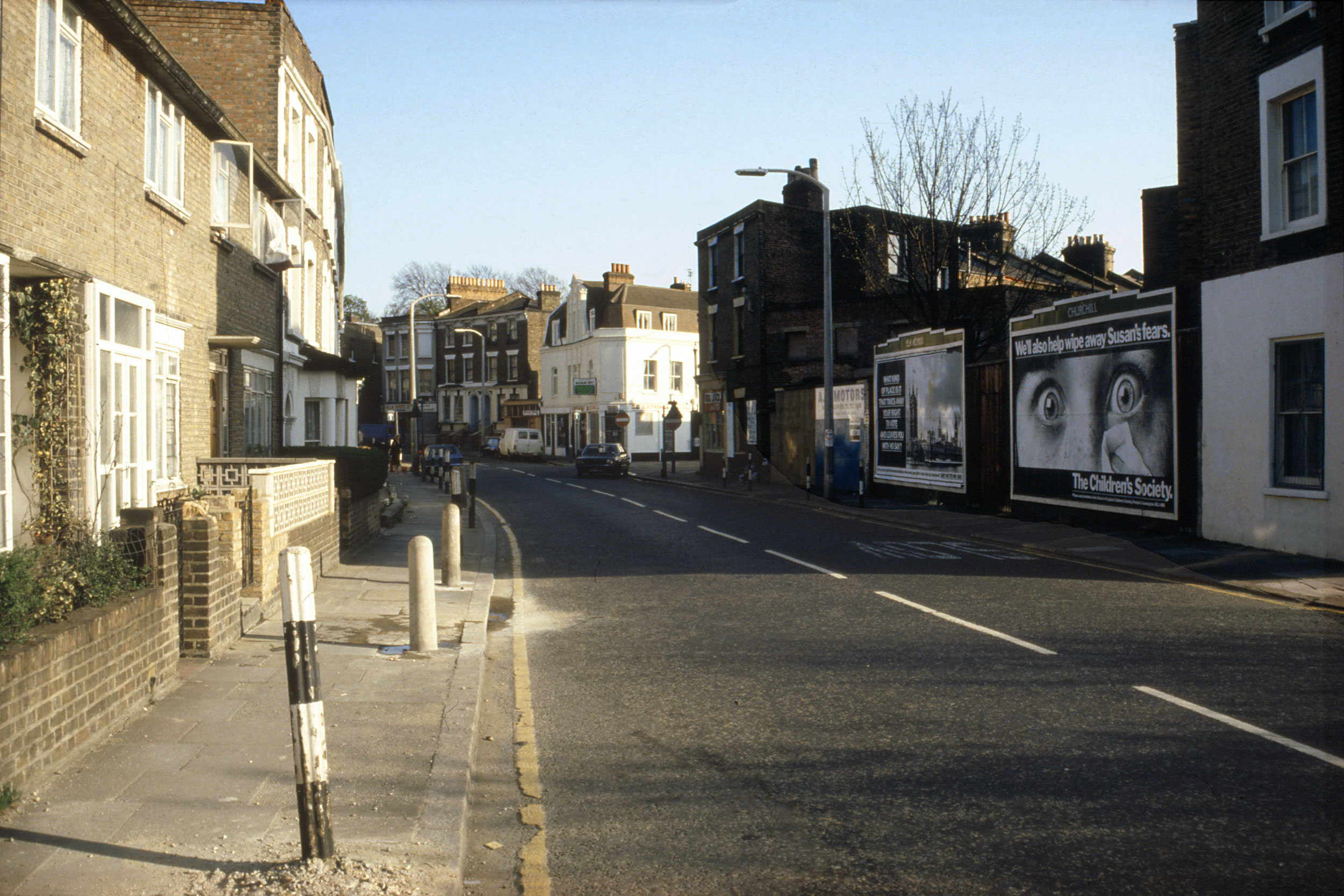
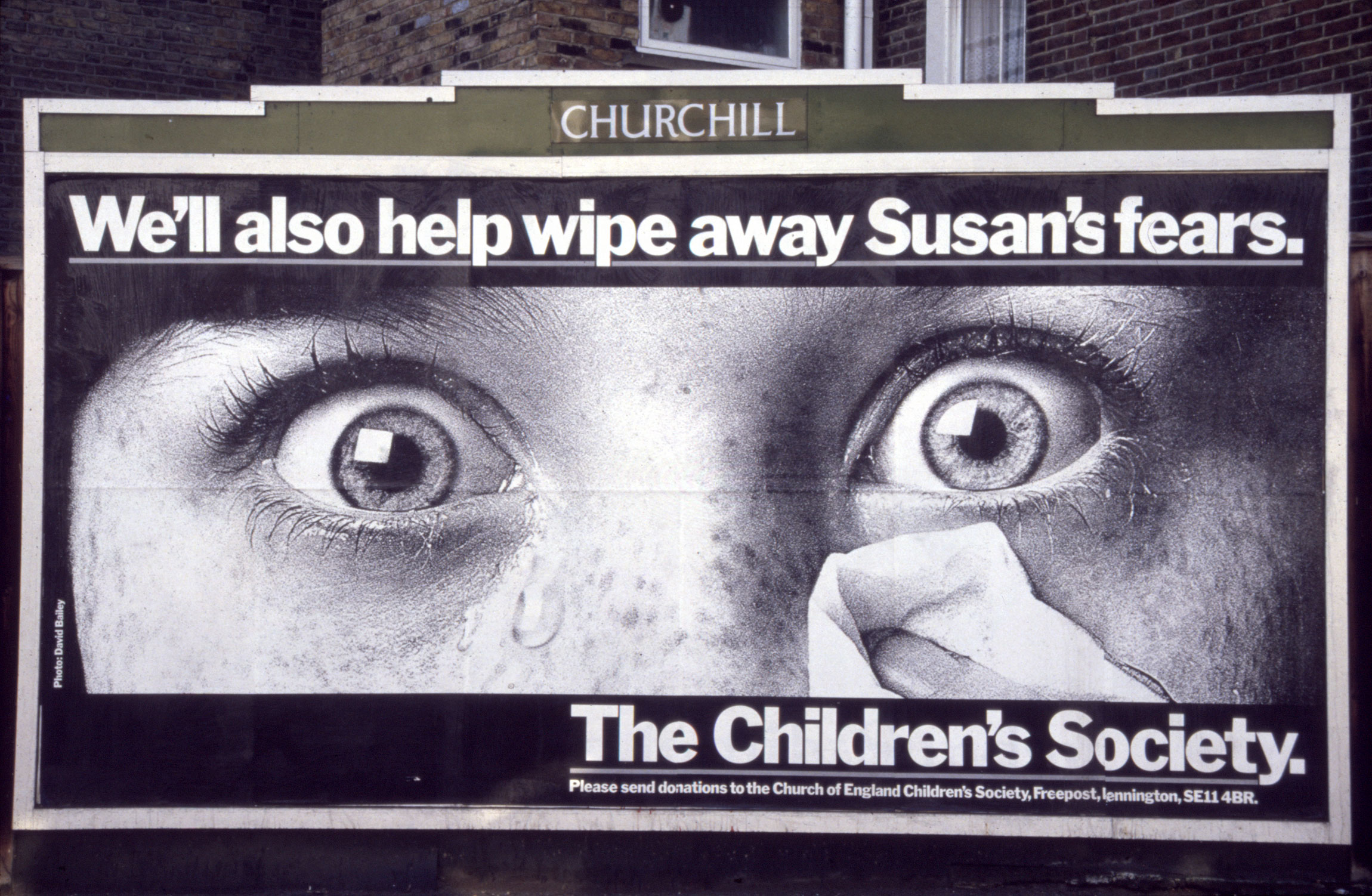
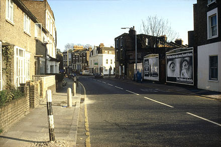
AD:
'CHILDREN'S SOCIETY' CHARITY FOR DISTURBED CHILDREN - (HOARDING -
RAILTON ROAD, HERNE HILL, LONDON, SE24) - (1984)
The content and action of this image was not confined by its
frame. The image is collaged into this (and other) locations like an
illustration into a 'synthetic-cubist' picture [note that the aesthetic
quality of such an illustration is irrelevant - its significance is
as a fragment of the 'real/'ready-made' exterior world inserted without
transformation into the mental realm of a 'painting'].
A frightened child's face is staring through the hoarding as if through the letter-box of the street, inducing a shock so exactly mirrored in its
enormous eyes that one allowed one's assessment of the reality of one's surroundings to be transferred through its gaze, changing their scale to a toy
town - if only it could enter this huge nursery of adulthood !
Thus I was forced to participate in a drama of childish insecurity mediated by an image that included our surroundings.
|
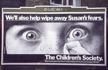
AD:
'CHILDREN'S SOCIETY' CHARITY FOR DISTURBED CHILDREN - (HOARDING -
RAILTON ROAD, HERNE HILL, LONDON, SE24) - (1984)
Though
the ad image is startling, beyond 'shock' it has no meaning or
motivational context without its external public location.
Ads such as these - images
collaged into their surroundings - are unlike the commonplace majority of
ad images that seek to capture and collect attention completely within
themselves/their hoarding-frame (like self-contained 'pictures' on a white
gallery wall). These 'collage-element' ad images turn any location that can support a public
hoarding into a special version of their story.
|
|

|
|
|
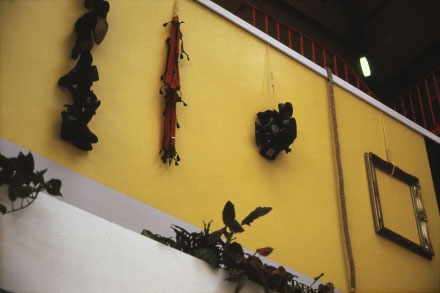
AD:
'BENSON & HEDGES' CIGARETTES: 'INVISIBLE AD' - (8-1992) - (HOARDING
- VICTORIA STATION, LONDON)
This yellow panel with its suspended junk-objects, with no text or title, blending into the muddle of signs around it, but over an unavoidable route across the vast station, makes no proclamation of its source except in so far as its decor of
'arbitrary'
shoes, braces, telephones, rope, picture-frame, limned in ones peripheral memory an unfocussed version of an image already familiar from years of ad-conditioning - a B&H packet.
Reinforcing subliminally, yet erasing as a foreground choice: constituting the image as if it were a 'potential of backgrounds' - feeding that part of us which 'notices without thinking' - cuing it for the moment when, from a shop's bewildering
medley of brands, it can precipitate a Gestalt-driven choice. This ad purposely submerges
itself in order to infest 'recognition' at a level below that of
aware-discrimination !
|
AD:
'BENSON & HEDGES' CIGARETTES: 'INVISIBLE AD' - (8-1992) - (HOARDING
- VICTORIA STATION, LONDON)
A
repeat of the previous caption in 'longhand':
This
(presumably 'experimental') ad-installation presents a 'peripheral' image of
a B&H packet. It implies the aim that though involvement is good,
recognition is not sought, it is even diminished :
Via
a long-running ad-campaign, an image of "B&H Gold" packets has
been clarified and imbedded in public recognition to the extent that its
gestalt can now be reduced in terms of 'clear present clarity', in order to
capitalise on the automatic aspect of 'recognition' and render the image a
more efficient subliminal affecter.
Firstly
- its identity of this hoarding with a B&H packet is diminished by its
'sideways' position. The 'uprightness' of this position is reinforced by the
objects (if noticed as such!) that constitute its pattern: they hang -
vertically, which helps reduce identification of the sideways B&H packet
to a mere yellow background wall.
Secondly
- if the image is consciously noticed and curiosity aroused,
its constituents are discovered to consist of a rather confusing (and thus
mentally involving) sequence of objects: shoes; braces; telephones; a rope
and a picture-frame. Their apparent triviality yet 'important' location
provokes curiosity and 'proves' that what exists here (in this practical
context of rail-station and notices) is a peculiarly 'special' message. The
fascination of these objects draws attention within the perimeter of the
overall B&H recognition factor: the yellow rectangle, delaying brand
identification or even (especially from nearby) the basic realisation that
this installation is in fact an ad - a designed and affective image !
Thirdly
- it milks 'sophistication' by referring to 1960s Minimalist art works - a
sophistication that accrues to the subliminally identified brand, and which
may dispense a dose of vanity during subsequent selection and purchase.
Plus, it constitutes yet another distraction that distances
recognition of the vulgar manipulative intentions of the ad designers.
.
|
|
|
|
|
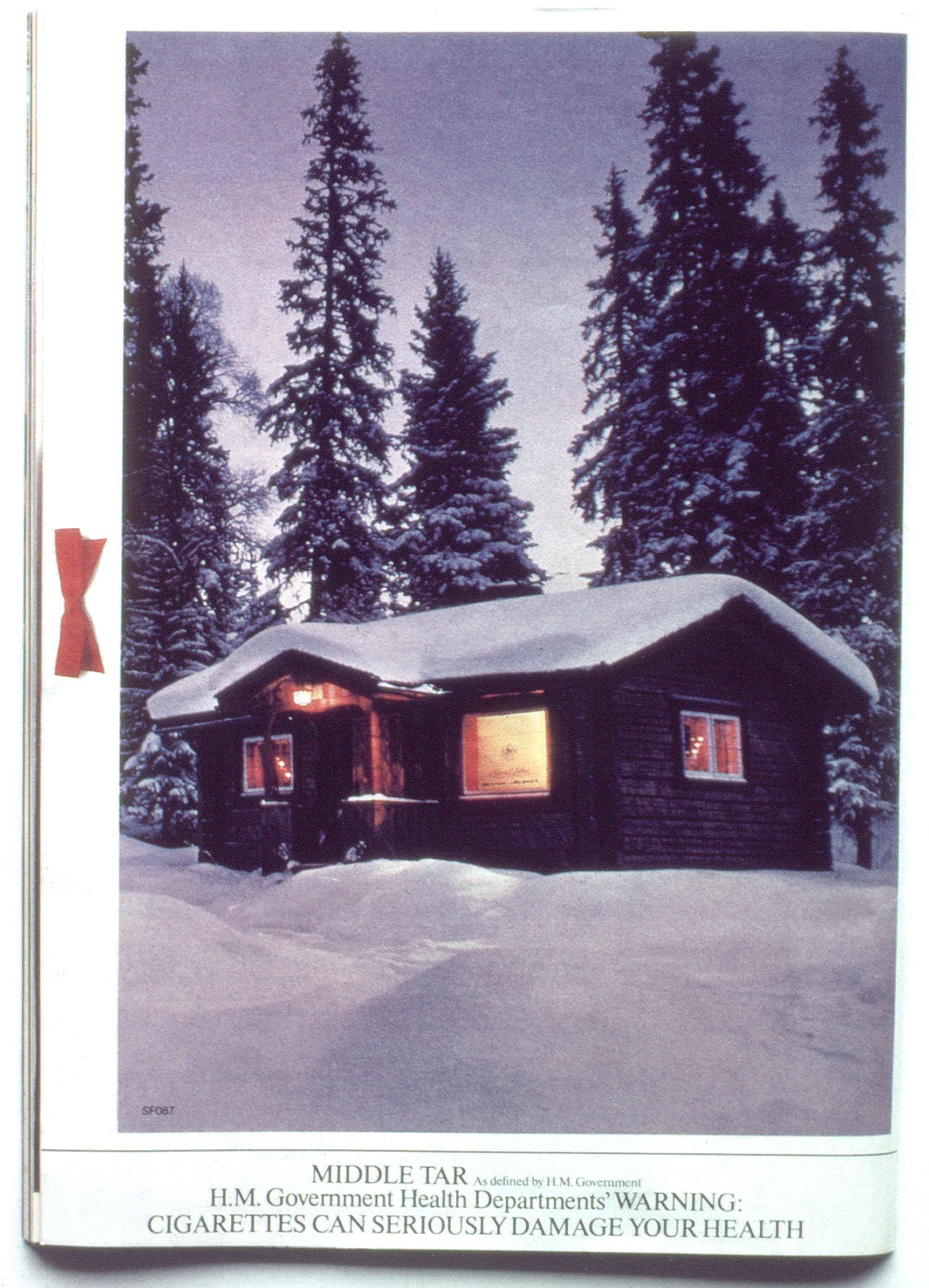
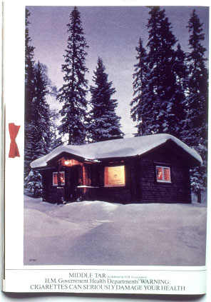
AD:
'BENSON & HEDGES' CIGARETTES: LOG-CABIN XMAS CARD - (XMAS-1979) -
(MAGAZINE PAGE)
As an experiential form/event this ad has 3 stages:
1 As a specialised media image which
2 takes control (realigns the gestalt) of other external images
3 which provoke desire and action:
Stage 1: A magazine page with a familiar Xmas-card picture - a cozy log-cabin in Santa's frozen forests. The warming glow in this ones welcoming window is however a gold B&H packet !
Stage 2: Apparently outside the B&H-rented picture space, subliminal to ones attention absorbed within the picture joke, a collaged (real-photo) red Xmas-card bow, with shadow.
The real cards outside this magazine, baited with this bow, hook this fascinatingly altered image to themselves, transforming their stale familiarity into mnemonics for B&H.
Stage 3: All cozy-cabin cards are now reminders that without the comfort glow of BandH the images on the mantle this Xmas will be less than welcoming - the act of buying the cigarettes closes the gestalt and restores the security of completeness.
|
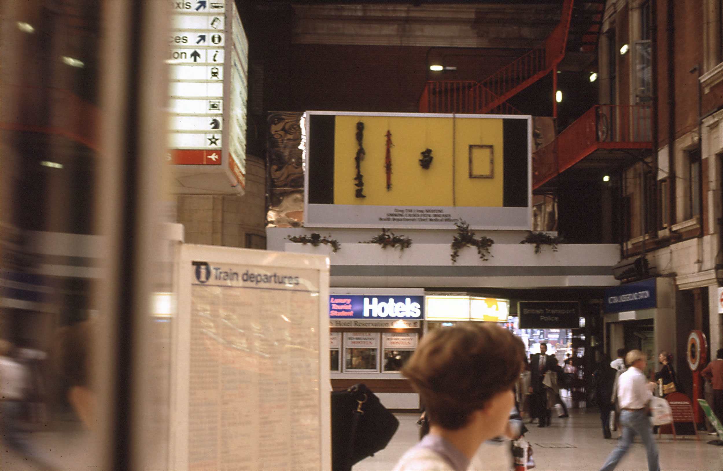
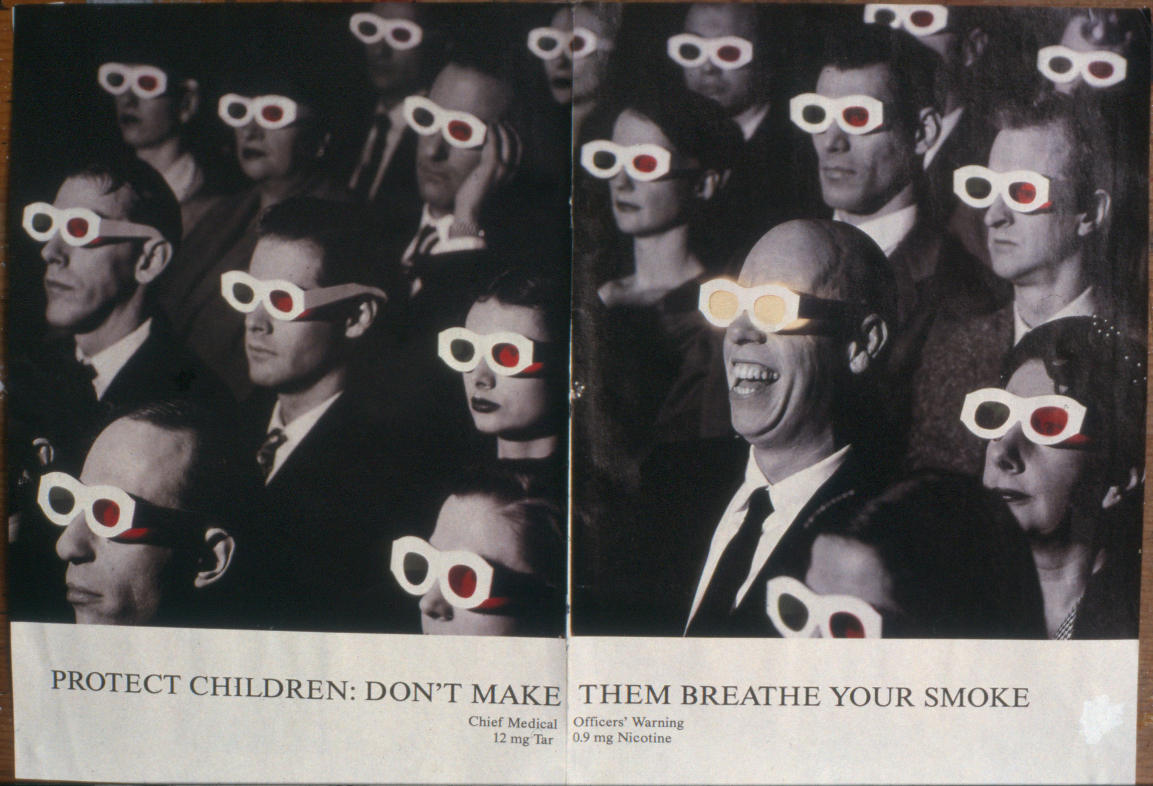
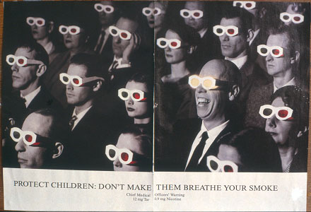
AD: 'BENSON & HEDGES' CIGARETTES: 3D
MOVIE AUDIENCE - (20-3-1996) - ("TIME OUT" MAGAZINE DOUBLE-PAGE)
|
|

|
|
|
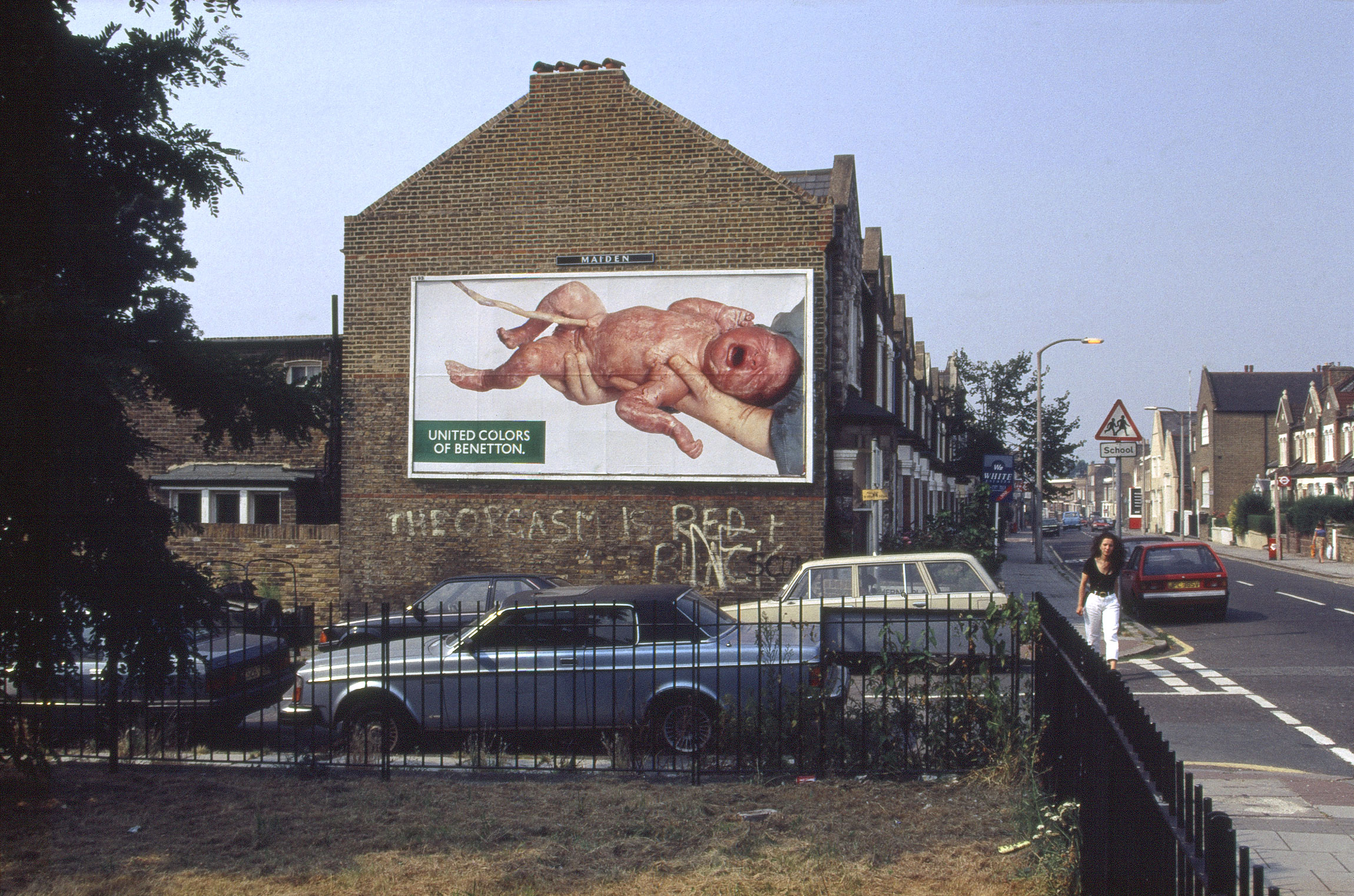
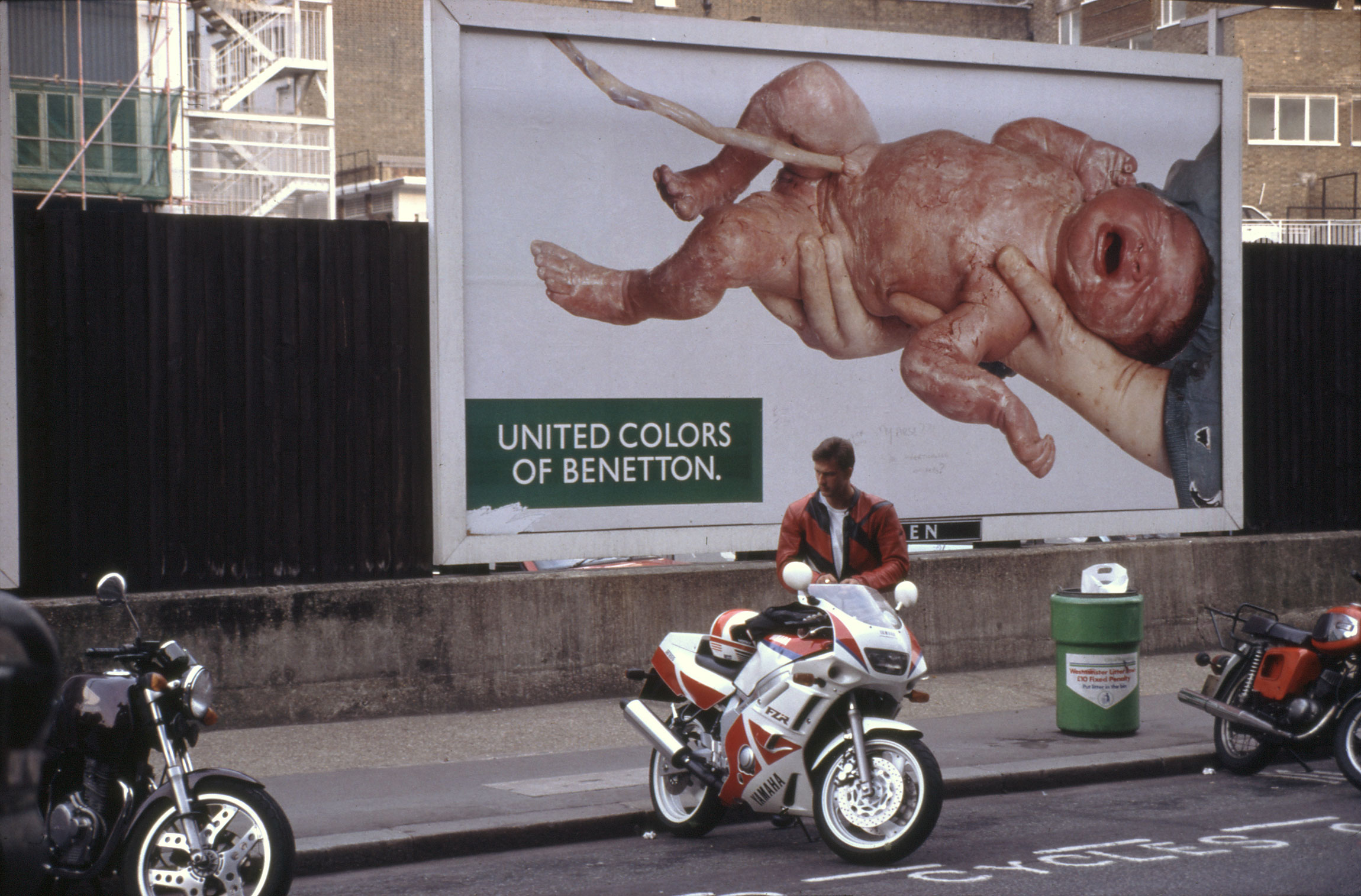
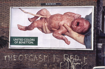
AD:
'BENETTON': BABY - (9-1991) - (HOARDING - RAILTON ROAD, HERNE HILL,
LONDON, SE24)
A
new-born baby on a suburban road. Insertion of this utterly ubiquitous but
shockingly unfamiliar image-subject onto public hoardings in the UK provoked
a "storm of protest" (often excused by the oblique criticism that
it "has nothing to do with Benetton's product: clothes - really?!).
Pathetically (and apparently without any publically mooted analysis) this
public-educational tool was quickly banned by our Advertising Standards
Authority! Censoring a 'newly discovered normal' image because it is
unfamiliar and suddenly disturbs the 'background' of many familiar sights,
deprives us of the new (social) insights that such a conjunction
provokes.
This extraordinary ad campaign collaged its ordinary/shocking images into
the malleable context of our public mental space.
|
AD:
'BENETTON': BABY - (9-1991) - (HOARDING - RAILTON ROAD, HERNE HILL,
LONDON, SE24)
|
|
|
|
|
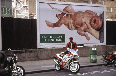
AD:
'BENETTON': BABY - (9-1991) - (HOARDING - ROAD NORTH FROM OXFORD ST,
LONDON)
Though both objects - new-born baby and young male
motorbiker - are commonplace, the simple fact that one is rarely seen in
public throws their relationship into the mental 'cooking-pot', provoking
immediate unfamiliar observations, interpretations, insights.
This is an example of an imaged subject matter that is
so informative yet simultaneously so shocking in its implications and associations, that it
acts like a 'window' into reality - an 'active icon' rather than a mere picture!
... in process
|
|
|
|
|
|
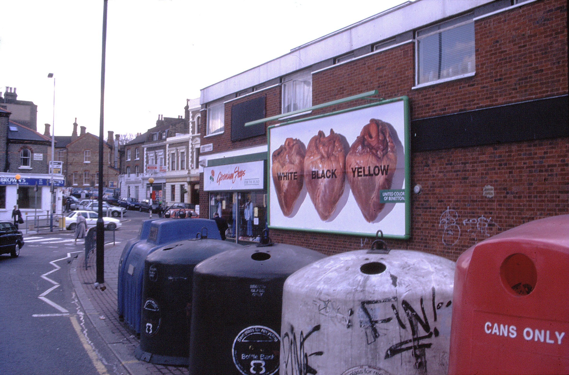
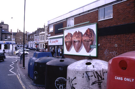
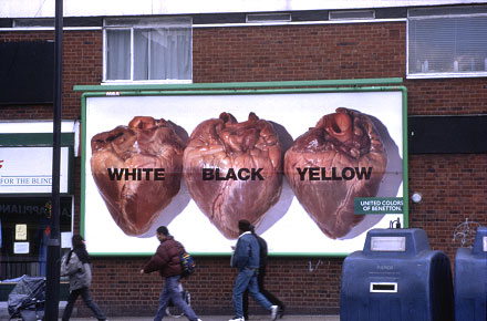
AD:
'BENETTON': HEARTS - (28-3-1996) - (HOARDING - S. CIRCULAR RD. (CNR:
NORWOOD RD.), TULSE HILL,
LONDON)
#
Oatly
|
AD:
'BENETTON': HEARTS - (28-3-1996) - (HOARDING - S. CIRCULAR RD. (CNR:
NORWOOD RD.), TULSE HILL,
LONDON)
|

|
|
|
AD:
'OATLY' (OAT 'MILK')- (29-01-2020) - (HOARDING - DALSTON LANE. (W. END /
CNR: KINGSLAND HIGH ST.), LONDON, E8)
Staring at Dalston Junction "Overground" station exit from
the opposite side of the rather busy Dalston Lane there is an unusually simple, subtle
and provocative ad. One experiences an initial shock of receiving a seemingly personal message as one
exits the station, 'shouting' at one in huge unmissable type (annoying traffic interruptions simply
force a more resolute effort to read and make sense of it). Only when one notices the
relatively small Oatly carton* beyond the fullstop does one realise that the statement is
also addressed to it. The duplicity of the statement - addressing first
oneself and then a product - persists in one's mind and attention, reinforcing one's
commitment to the sentence.
I cannot 'solve' the mental split between
these two 'directions of address' - the harsh but frustrated command that
demands my attention / the mild, almost kindly 'family familiarity' of
"Oh, it's you again" addressed to the Oatly. This is a 'collage' -
a single element whose content is perceived
differently according to its
external environment of reference - in this case,
firstly, the immediate external reality of ones exit from the tube station
into a shocking personal confrontation from across the road, and secondly,
an internal visualisation of the Oatly as if it's a shopping reminder -
thus
the message is rendered complete, transformed
as a task - reformed as a whole only in its
(intended (by the ad
designer) potential as action
* Oatly Carton - pic
|
?
<<<<< ver-1 I cannot 'solve' the mental split between
these two 'directions of address' - the harsh but frustrated command that
demands my attention / the mild, almost kindly 'family familiarity' of
"Oh, it's you again" addressed to the Oatly. This is a 'collage' -
a single element whose content divides//is divided in the brain according to its
external environment of reference, and reforms as a whole only in its
(intended) potential as action
(firstly
the carton on the ad acts as an exclamation mark at end of the personal
message This
is a verbal collage ... The shout-at people exiting the tube station
attracts/holds attention (especially with the help of the passing/obscuring
traffic! ###) - and makes them look again & again until the Oatly carton
is noticed beyond the fullstop ... suddenly we're in a shop: Oh its you
again! ... don't forget! This is a 'collage' -
an object - the text, speaks to us in two locations:
our external space and our internal planning a single element whose content
is divided according to its environment of reference, and
which reforms as a whole only in its
(intended) potential as action
<<<<<
|
|
|
|
|
|
|
|
|
|
|
|
|
|
|
|
|
|
|
_20.jpg)